Exporting Twitter Problems

Twitter’s new anti-harassment tool is lame! I wrote about why it actually kinda sucks for Wired.

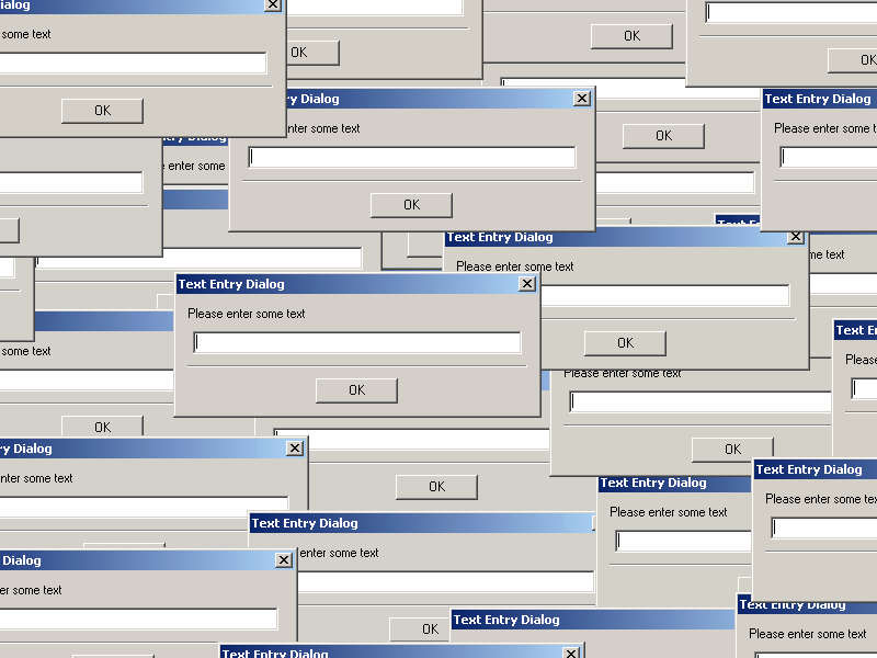
The mere creation of a list doesn’t give due respect to the phenomenal complexity of online hate and abuse. The list is black and white – an account name is either present or absent, the CSV list item is either imported or it isn’t. But there is no single standard for harassment online; it’s not a simple toggle switch, so the tools built around it can’t be as simple as binary filters. more

Writers of Color

Durga Chew-Bose, Jazmine Hughes, Buster Bylander and I were all tired of hearing that it’s too difficult to find non-white writers, so we decided to do soemthing about it. At the heart of our Writers of Color project is a directory of professional listings for writers which is queryable by location and topical specialties (and, for those who want to poach from competitors, searchable by publication name). We’ll also be retweeting opportunities posted to our audience at @writersofcolor, as well as compiling a public Twitter list for the editors to follow and explore. I’ve uploaded the WordPress plugin that makes all the magic happen to GitHub, in case you’d like to try something similar for a different group or industry. We unveiled all this by taking over the Today in Tabs newsletter, where I served as Bijan Stephen’s guest intern.

Seriously, I’ve had enough of this shit!

CSI Cyber

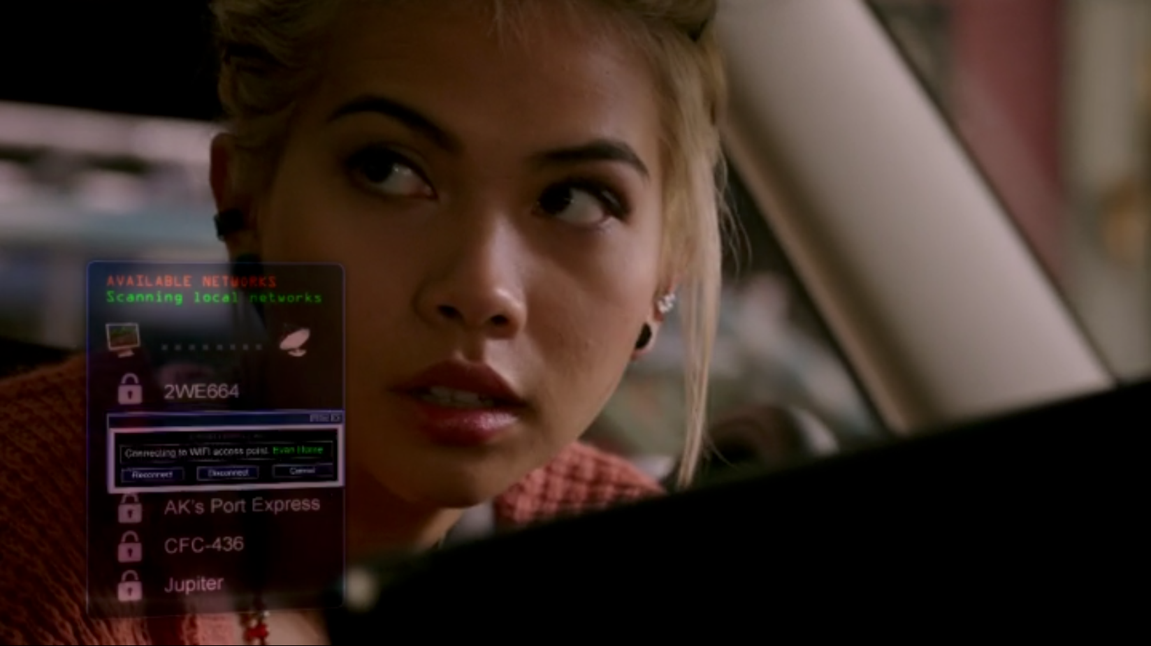
For Wired, a breakdown of the narrative techniques used on the new CBS internet crime drama CSI: Cyber to turn technical concepts into plot points.

Salient visual distinctions between different pieces of code are immensely valuable to programmers trying to read it—numbers appearing in blue, variables in green, that sort of thing—but this example oversimplifies the practice to the point of uselessness: “Oh! There’s malware!” hiccups one of the good guys as the evil red code starts to scroll into view. Dramatic visuals surrounding an incidental clue presented on a computer is by now a common tactic on police procedurals—Access Denied! Match Not Found!—but it seems reasonable to expect a little more nuance and accuracy from a show which is entirely about those computers and the challenges we face in relating to them.

more

Cartoon Cereal Ads

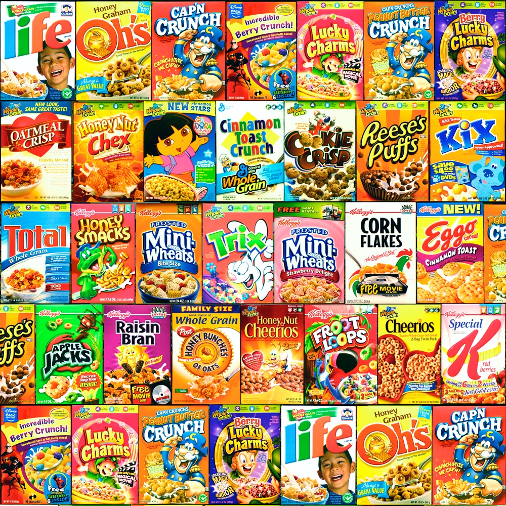
Here is a new installment of Facepalm Pilot, my McSweeney’s column about technology and stupidity, with an interactive data visualization which attempts to analyze the nutritional characteristics of the various cartoon characters used to advertise sugary breakfast cereals to kids.

When frazzled parents finally concede defeat on the daily battlefield that is breakfast, their kids are often delighted, since they are unable to steel themselves against expert marketing campaigns for which they are the coveted target demographic. Television aimed at children is funded primarily with ads in which brightly colored cardboard boxes are hawked by brightly colored cartoon characters during commercial breaks between shows featuring slightly different brightly colored cartoon characters. But there may still be a partial compromise on the horizon: by assessing the nutritional profiles of the mascots being used to sell the cereals, perhaps we can begin to understand underlying patterns by which we can help keep children healthy while also indulging their mascot preferences.

more

The Way We Scabbadeedlybop Now

For Mental Floss magazine, a catalog of the various ways in which lyrics web sites like Genius attempt to represent the purely phonetic syllables used in scat singing, as with the bizarre 1994 one-hit wonder I’m The Scatman.

How does the modern internet treat this most bizarre of cultural artifacts when its only goal is to capitalize on it as an ad surface? On some level these snapshots seem to point toward subjective perceptions of art and the love it can inspire in us, but they are then promptly torn into nonsensical shreds by the brutal Darwinism of online marketing. more

[ Stop It Stop It Stop It ]

I wrote a pretty intense essay for Matter about that awful thing that recently happened (whatever it was).

Our New 64-Bit World

A new article for Wired about how a technical problem at YouTube related to the music video for “Gangnam Style” points to a whole new scope for the technology industry.

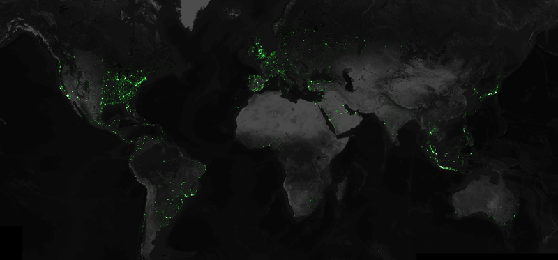
When “Gangnam Style” hit 2 billion views back in May, a record at the time, Google’s engineers noted that it might also soon overflow the limits of a 32-bit integer. That fix was as simple as changing the memory space allotted to that data point from 32 bit to 64 bit, which is actually a relatively small change. It didn’t actually “break YouTube’s code” in any meaningful sense, let alone “break the Internet.” What’s mind-boggling about all this, though, is that the number that was pushing those limits loosely correlates with a quantity of people.

more

Facepalm Pilot

I’ve somehow ended up with a new column for McSweeney’s called Facepalm Pilot, in which I’ll fiddle around with “the intersections of technology and stupidity.” There are many of these! So, data-driven satire, I guess?

First up, an interactive graphic exploring scientific and ethical conclusions based on zombie sociology.

My Triumphant Return To Academia

I wrote what I believe is the The Awl’s first technical white paper.

Gyro

My goal here was ostensibly to put together an essay for the Village Voice about the new Aphex Twin album, but it’s actually more about the absence of the new Aphex Twin album, and how I got highly attached to an amazing leaked track in the interim.

Not only has James never released another album like Selected Ambient Works 85-92 — worse yet, these days he just doesn’t really release albums at all. It’s been 22 years since that debut, and for more than half that time he has existed only as a beloved ghost. The last thing he released before disappearing was 2001’s Drukqs — twisted, knotty, and in places totally incomprehensible. Frankly, it has proven exhausting to be a fan of a musician who was first brilliant, and then difficult, and finally just totally absent. more

Apple + U2 album release

I wrote a very opinionated post for Wired about Apple’s recent decision to force downloads of the new U2 album on all iTunes users.

There’s a very simple reason why this is unprecedented, and that is because it doesn’t make any sense. Never before has such a major technology company also operated as publicist for a creative artist. The whole endeavor yearns desperately to be a landmark new innovation for the music industry, perhaps something along the lines of Radiohead’s legitimately earth-moving In Rainbows, which was self-released with variable pricing in 2007 and remains the gold standard against which music industry innovation is measured. But this is not In Rainbows, and as such should instead be remembered primarily as a monumental blunder by the tech industry.

more
Update: At 1:30pm today I’m going to be a guest on CHQR AM 770 in Calgary to discuss this fiasco; listen here.

Simpsons reviews

Two short blurbs for The Verge as part of their attempt to crowdsource reviews of every episode of the Simpsons.

CSS Zen Garden API

Just dug up a terrifically stupid project I did a while back – a submission to the CSS Zen Garden design gallery which formats the usual page content to look like a fake REST API response in JSON format. It’s totally useless, but all the same, live demo + GitHub.

Counting White Dudes

I’ll mostly be working on secret internal tools in my new role at the New York Times, but I also recently built a neat public-facing data visualization for Scratch Magazine, a digital magazine about the financial and logistical realities of working as a professional writer. I created an interactive graphic which reflects the demographics of the leadership in journalism. They are almost entirely white and male. Surprise?

This data visualization actually fails in an interesting way. The color scheme was conceived such that one parameter (hue) would map to gender (pink vs blue) and another parameter (brightness) would map to race (light for white people and darker for people of color). This doesn’t actually work, though, because in the entire corpus of publications and editors surveyed there isn’t a single female editor of color. As a result, one entire quadrant is empty and there’s no need for dark pink. It therefore might have made more sense to give the box mapped to the lone black male editor much flashier and more salient treatment, but there’s also something poignant about the industry’s intrinsic racial bias being strong enough to prevent us from using, you know, actual colors.

I’ve shared the source code for this data visualization on GitHub and have generalized it a bit so it can be easily reused to set up similar audits of other industries. Please get in touch if you’d like some help in doing so.

NYT

Extremely exciting news: I’ve started working at the New York Times as a data visualization engineer on the data science team.

Twitter and Television

A few nights ago I stayed up late to start watching season 2 of House of Cards as soon as it premiered, and as you might expect, I freaked out when Frank Underwood immediately kills Zoe Barnes in the first episode, so I wrote an essay for Wired about the odd sensation of sharing a cultural experience like that via the internet despite the availability of video-on-demand services like Netflix.

Even in the middle of the night, I wasn’t alone. Both Netflix binges and traditional broadcast television are increasingly subject to an internet-based social halo surrounding fandom, and nobody wants to be the one who misses the party.

more

Google Glass accessories

My article for Slashdot about the importance of an accessory market to the success of Google Glass. This time, a relatively civil discussion!

Each iPhone accessory and app is both a potential selling point as well as a tether for existing users—if you need to re-buy your cables, apps, docks, mounts, and speakers, even a free phone starts to look a lot less compelling. Google Glass isn’t a phone and doesn’t have any direct competitors running iOS, but it is still the closest thing there is to a market leader in the emerging world of wearable computing. As such, it currently faces similar strategy questions which could prove just as influential in defining its success.

more

New Yorker Projects

I’ve completely neglected to post my recent projects for The New Yorker:
  • “What You Look Like to a Social Network” – essentially dumping all the data fields shared about your user accounts by the major social network APIs into a single zoomable D3 chart for chilling comparison.
  • The November 7th Twitter IPO captured in an interactive infographic which lets you compare the revenues and valuations of major tech companies both against each other and against themselves over time. Written with D3, and with an unreasonable amount of attention paid to the “bounce” option among the easing function selectors.
  • Mapping the failed attempts to defund Obamacare so Ryan Lizza could proceed with a characteristically astute political analysis.
  • Restaurant review map, with a particularly lovely introduction by Amelia Lester.
  • An interactive jQuery timeline of women in the Senate to accompany the Kristen Gillibrand profile by Evan Osnos.
  • Introducing Premise, a new company that creates “offline” financial indices by having overseas workers manually enter vegetable prices into their smartphone app. Written entirely using old-fashioned journalism – no programming whatsoever!
  • Breaking Bad‘s various meth money plot points in a jQuery bar chart.
  • Corporate fines compared in a D3 bar chart.
  • Evolution of the Dow Jones, simple mouseover effects built with jQuery.
  • a number of short music items for the print issues which appeared in the anonymous critics’ notebook section under “Goings On About Town,” the event listings section.

New Yorker

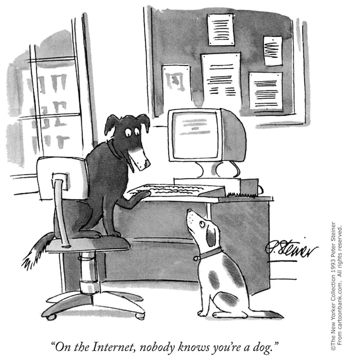
An update: I’ve started working at The New Yorker doing a mix of writing and programming – tech projects for the editorial division, basically. I’m still not quite sure which dog I’d be in this scenario.