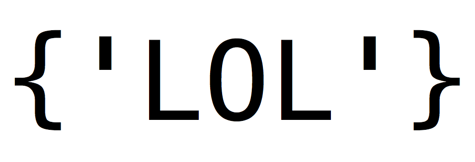
Just dug up a terrifically stupid project I did a while back – a submission to the CSS Zen Garden design gallery which formats the usual page content to look like a fake REST API response in JSON format. It’s totally useless, but all the same, live demo + GitHub.
Tag: CSS
-
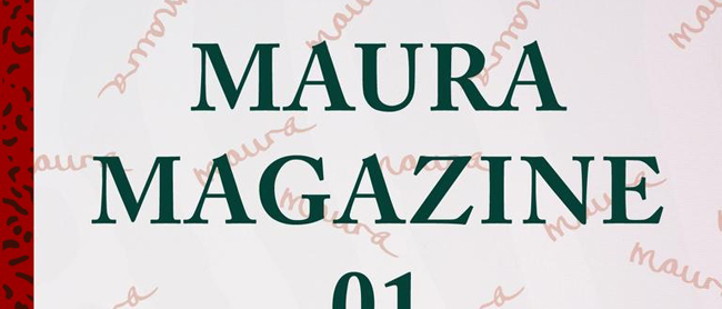
Maura Magazine
Goodness, I can’t believe I’ve neglected to mention this for so long. We’re already four issues in, but I’m the main geek behind the web presence for Maura Magazine, a new digital weekly for iOS devices helmed by the amazing writer and editor Maura Johnston. She fielded my pitches at the Village Voice for a while, and you may have also read her work at a number of other wonderful publications.
This is her new experiment in small-scale direct journalism. Using an infrastructure provided by my fellow geeks at 29th Street Publishing, she publishes a handful of long-form stories each week which are pushed to a custom app loaded on the iPads and iPhones of her eager subscribers, each of whom pays a buck or less per issue, with payments automated via iTunes. Writers get paid, readers don’t have to deal with ads, everybody wins.
There’s been more coverage of this than I’d care to outdo here, so let me just refer you to some of the other guys:
As for the site, a lot of the heavy lifting is being effortlessly handled by WordPress, but I’m still really excited about a lot of the things happening in the custom functions I wrote — these are among the coolest WordPress ideas I’ve ever come up with. I don’t want to go into too much detail since we’re not openly sharing the plugins yet, but in a nutshell, the paywalls are dynamic, and you will start to see them move and react as we continue to charge along here. For example, this past weekend one of the articles was temporarily unlocked to match the HBO schedule.
And, as with my last attempt to merge tech with editorial, a hearty shout out to my good friend Buster Bylander, who jumped in with his amazing visual design sense once I was done fiddling around with the code for generating the content loops. We are both very proud of this. Please subscribe!
-
Have you seen my blog posts about CMJ? Y/N

New York’s annual CMJ music festival is happening again this week. I’ve written about it before via short reviews of the litany of concerts held across the city, but this time I wanted to focus on the awesome daytime programming hosted at NYU before the shows commence each evening. So, for the Village Voice, a series of mock flow charts which help* you pick the right discussion panels to attend (* = they do not actually help).
Update: these broke with the latest site relaunch :(
Tuesday, October 16
Wednesday, October 17
Thursday, October 18
Friday, October 19A few interesting footnotes here:
First, we considered putting the charts together as giant image files, which is how this sort of thing is usually done, but eventually I successfully pitched the idea of building the charts right on the web page. This makes for a much more pleasant user experience, since traversing the decision tree is just like scrolling through an article without any cropping or resizing weirdness, and the content can be highlighted and copied just like any other text. It also reconfigures itself much more cooperatively for viewing on mobile devices than a static image file would.
In a way, it’s pretty simple — essentially, we just created a whole bunch of divs and applied tons of inline CSS to them, most notably setting the background images and the padding to create the illusion of interconnected lines and arrows flowing between them. This is generally frowned upon as a web design practice, but for a single-use scenario like this it actually works quite nicely, because I didn’t have to add any external stylesheet files to the CMS and it’ll remain remarkably stable as the Voice’s site evolves in the future.
But man, that’s a lot of inline CSS! For example, generating single box to put a question in requires all these rules (many of which are duplicated because they get split across a parent and child div):
width: 500px; min-height: 150px; padding-top: 70px; background:url(“6.png”) no-repeat center top; background-color: #F9FFB2; padding: 20px; border: 1px solid #333399; text-align:center; margin: 0 50px 0 50px; font-style: italic;
Worse yet, since it’s all stored in an inline attribute, this would need to be repeated in full every time you want to generate a box of that type. And if you later need to change something — say, the images aren’t lining up quite right, or you need more vertical space for text — you’d have to go back and manually fix every instance. So in order to make this easier, I wrote a little set of scripts in PHP which dynamically applied the CSS while looping through the content I wrote for the boxes. I’ve done a fair amount of both writing and coding over the past few years, but it was really neat to finally have a project in which both were so tightly woven together.
Second, please also note the awesome visual design work by my friend John Bylander, who first brought the rough demo charts I sent him to life with subtle color and typography tweaks, and then cobbled together image files late into the night.
And finally, a nod to my sources of inspiration for this: former Village Voice music editor Rob Harvilla, who back in 2007 wrote about the rapper Mims using diagrams to thunderous acclaim, and then in 2010 covered the CMJ panels with a series of snarky comments not unlike my own Q&A content here. And then there’s also the extensive timeline of future events from sci-fi movies as compiled by the Awl, where a close examination of the markup helped me figure out how best to approach the CSS here.
See you next year, I hope.
-
On being yellow

At long last, here’s the new web site. As you have probably noticed, it’s very yellow, which I absolutely abhor, but there’s a good reason behind that. More on that in a minute.
After entirely too much procrastination, I finally got around to relaunching using WordPress. I’ve been working with WordPress for years, so I didn’t have any excuse other than the time it took to convert the old flat HTML files (yikes!) to WordPress posts. (I never said it was a good reason.)
Since I have a tendency to make everything I do far more difficult than it needs to be, I’ve also gone back and added as many relevant pictures as I could find. There were a couple of edits here and there, but for the most part the text content is the same — that is, except for the article excerpts I added all over the place. The end result is that even with the old items, there’s now far more content to read and look at, and now that everything has comment functionality, you can even interact.
I get a much better admin interface on my end, which should translate into updates that are more timely and regular. There’s also an RSS feed for those of you who might want to check up on me more regularly (all three of you). All of this should have happened in about 2005.
One of the other reasons it took me so long — after I had made up my mind to switch, I mean — is that I built some things along the way. I wrote this WordPress theme myself, and it has some cool extra functionality built in. I’ve disabled it for now, but I should be rolling it out eventually. (When I’m good and bloody well ready, so stop asking.)
That stuff is also the reason it’s yellow. Sorry, was that anticlimactic?
-
Identity crisis
My fly new net stylings = awesome.
Spending my Saturday nights working on them = less awesome.