CNN election coverage
Lately I have been on CNN’s election night coverage, in particular interactive data visualizations for the Senate and the House.
D3 Text Wrapping
It’s been more than a year since I posted it on GitHub<, so I suppose I should finally acknowledge the existence of my text wrapping plugin for D3.js. It has already been discovered by some folks (including Mike Bostock, who enthusiastically described it as “generalized somewhat.”) Gregor Aisch’s d3-jetpack also contains a simpler implementation of this feature based on counting characters instead of measuring the width of the rendered text.
Cartoon Cereal Ads
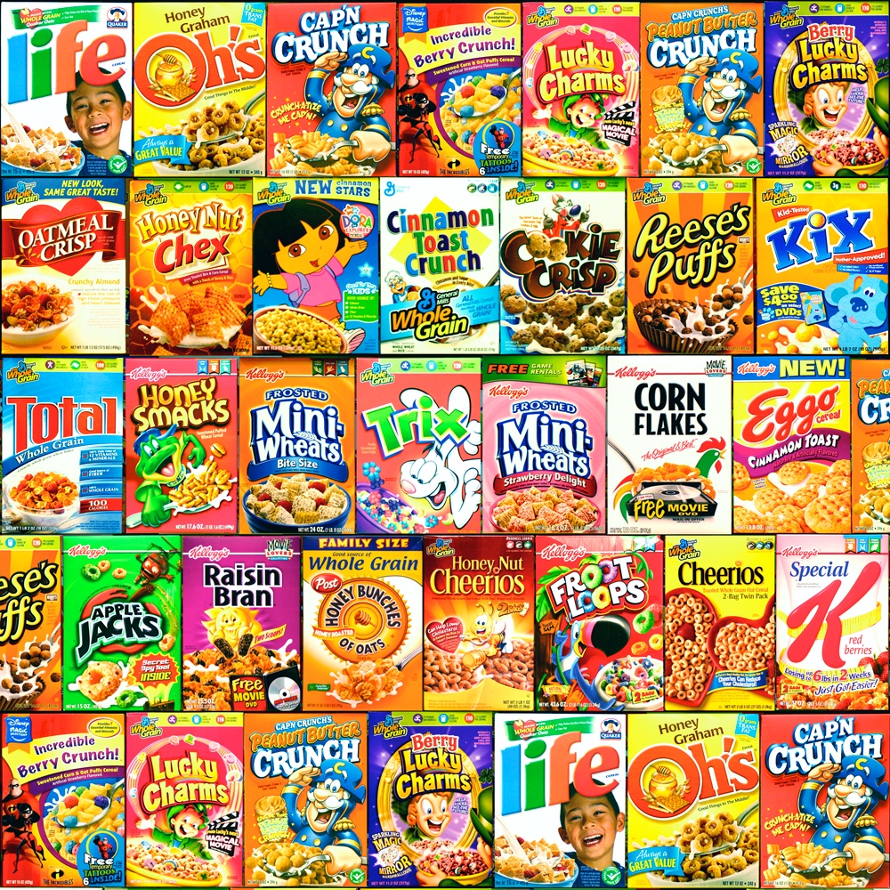
Here is a new installment of Facepalm Pilot, my McSweeney’s column about technology and stupidity, with an interactive data visualization which attempts to analyze the nutritional characteristics of the various cartoon characters used to advertise sugary breakfast cereals to kids.
When frazzled parents finally concede defeat on the daily battlefield that is breakfast, their kids are often delighted, since they are unable to steel themselves against expert marketing campaigns for which they are the coveted target demographic. Television aimed at children is funded primarily with ads in which brightly colored cardboard boxes are hawked by brightly colored cartoon characters during commercial breaks between shows featuring slightly different brightly colored cartoon characters. But there may still be a partial compromise on the horizon: by assessing the nutritional profiles of the mascots being used to sell the cereals, perhaps we can begin to understand underlying patterns by which we can help keep children healthy while also indulging their mascot preferences.
more
Counting White Dudes

I’ll mostly be working on secret internal tools in my new role at the New York Times, but I also recently built a neat public-facing data visualization for Scratch Magazine, a digital magazine about the financial and logistical realities of working as a professional writer. I created an interactive graphic which reflects the demographics of the leadership in journalism. They are almost entirely white and male. Surprise?
This data visualization actually fails in an interesting way. The color scheme was conceived such that one parameter (hue) would map to gender (pink vs blue) and another parameter (brightness) would map to race (light for white people and darker for people of color). This doesn’t actually work, though, because in the entire corpus of publications and editors surveyed there isn’t a single female editor of color. As a result, one entire quadrant is empty and there’s no need for dark pink. It therefore might have made more sense to give the box mapped to the lone black male editor much flashier and more salient treatment, but there’s also something poignant about the industry’s intrinsic racial bias being strong enough to prevent us from using, you know, actual colors.
I’ve shared the source code for this data visualization on GitHub and have generalized it a bit so it can be easily reused to set up similar audits of other industries. Please get in touch if you’d like some help in doing so.